Image
A box of known shape, an image that fills it, and the brand's own texture underneath.
GdImage
A reserved box, lazy loading, async decoding, and the survey grid as the ground while the image is in flight. It renders a plain img — the optimisation happens where the file is made, not in a build step. srcset and sizes pass through for an app that has a pipeline of its own.
Code
<GdImage
  src="/images/news/envelope-cover.webp"
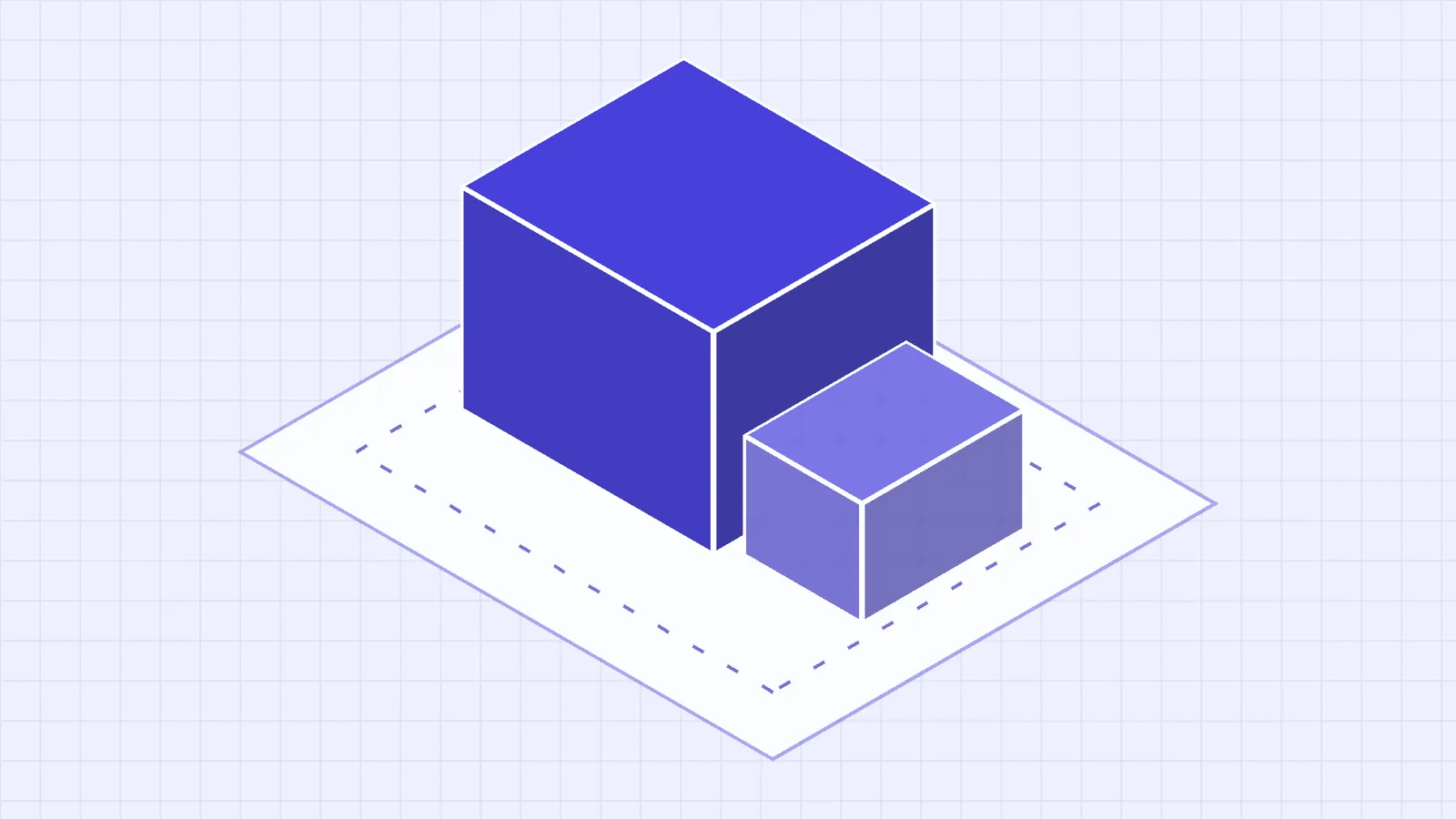
  alt="An axonometric parcel with the block of buildable space standing inside it."
  ratio="16/9"
              :width="1600"
              :height="900"
/>
Props
srcrequiredstring—A `public/` path or an absolute URL.
altrequiredstring—Required. Replaces the image for a reader who cannot see it. Pass `""` to assert the image is decorative.
ratio"16/9" | "3/2" | "4/3" | "1/1" | "4/5" | "21/9" | "auto""16/9"Reserves the box before loading, so nothing below it moves. `auto` keeps the image's own proportions and gives up that guarantee.
fit"cover" | "contain""cover"`cover` crops to fill — artwork and photography. `contain` fits the whole image in — a diagram, where a crop removes meaning.
radius"none" | "md" | "lg" | "xl" | "2xl""2xl"Matches the card family. Use `none` inside a flush card — the card already clips.
widthnumber—Intrinsic width. Feeds srcset generation and sharpens the reserved box.
heightnumber—Intrinsic height.
srcsetstring—Candidate files, standard HTML. This component does not generate them — pass the output of whatever does.
sizesstring—The CSS `sizes` grammar — `"(min-width: 800px) 50vw, 100vw"`. Inert unless you also pass `srcset`.
prioritybooleanfalseThe one image above the fold. Eager, high fetch priority, preloaded. Marking several defeats it.
fallbackIconGdIconName"image"The glyph on the plaque when the image fails.
tint"accent" | "green" | "none""accent"The wash under the survey grid, matching `GdCardMedia`.
GdFigure
The same image inside a figure, with a figcaption under it. Takes every GdImage prop and adds three of its own.
Code
<GdFigure
  src="/images/news/overlays-cover.webp"
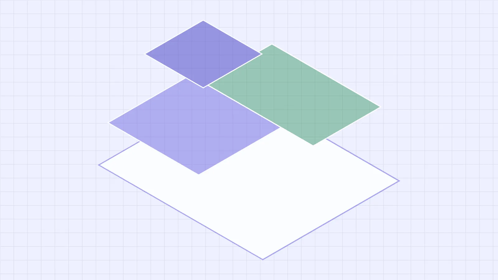
  alt="Three constraint planes floating above a single parcel."
  caption="Overlays sit above the envelope — any one can change the answer it gave."
  credit="Riverton City scheme, illustrative"
  ratio="16/9"
/>
Props
captionstring—Accompanies the image, for everyone — what the picture cannot say for itself. Not a second copy of `alt`.
creditstring—Attribution: photographer, agency, licence. Set quieter than the caption.
widebooleanfalseBreak symmetrically out of the reading column. Prose is held to a measure because that reads well; an image held to it is just small.
Inside a card
GdCard flush drops the padding so the image can meet the card's edge, and radius="none" lets the card own the corner. Rounding both is the bug: the image's corners sit inside the card's, and the card's fill shows through four small wedges.

What a certifier is actually checking
Code
<GdCard flush interactive to="/news/reading-an-envelope">
  <!-- radius="none": the CARD clips. Two radii leave the card's fill
       showing in four corners. -->
  <GdImage :src="post.cover" :alt="post.coverAlt" ratio="16/9" radius="none" />
  <div class="body">…</div>
</GdCard>
Loading and failure
Both states are the same texture, and that is deliberate. A hole in a page reads as a broken page; the survey grid reads as part of the design that has not finished. On error the grid stays and the picture glyph appears on a plaque — the same plaque GdCardMedia uses.
The alt text is not shown as visible copy in the failure state. It is written to replace a picture, and a sentence written for that job reads as an error message when it is printed as one; it stays on the element for assistive technology.

Where the rest lives
Content images covers the decisions this component does not make: which directory a file belongs in, why alt and caption are different jobs, and why a collection needs one ratio.